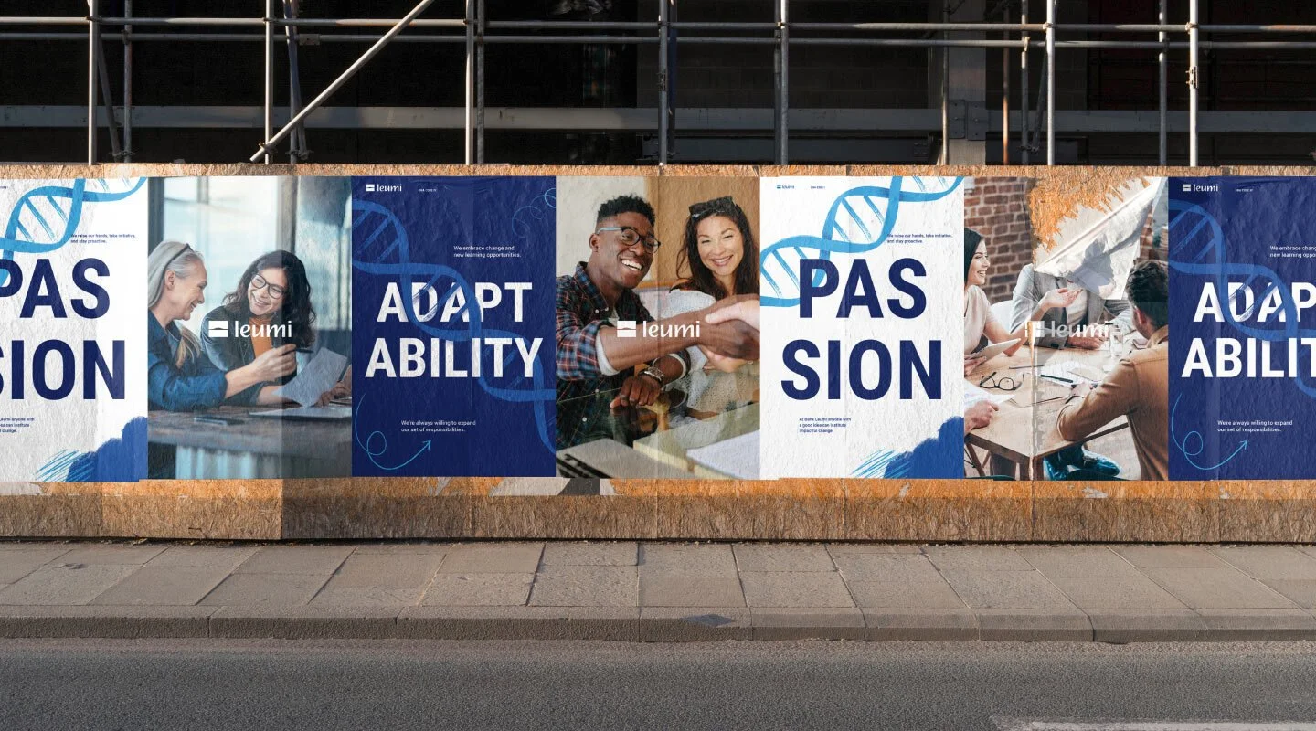
The Israeli Bank establishes in the U.S
Leumi, the second largest bank in Israel, sought a bold brand system to establish them as a trust-worthy name in the US. Together with Any Studio, we created a relatable, down-to-earth brand identity and communication.
Branding
Photography
Illustration
I’ve worked with:
Any Studios
Brandbook. Visual language, photography guidelines, layouts, templates…
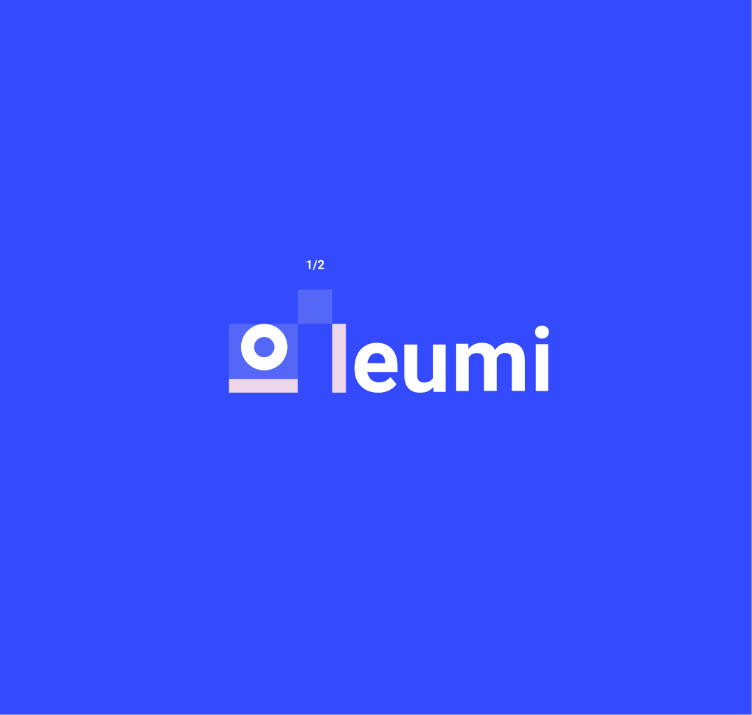
Logo lifting: the rise
The existing logo has a strong symbolism with it’s horizon and sun, but lacks of simplicity. The idea here was to keep only the necessary shapes, to convey the same message, in a bolder and more modern way. Leumi rises and widen its horizons.
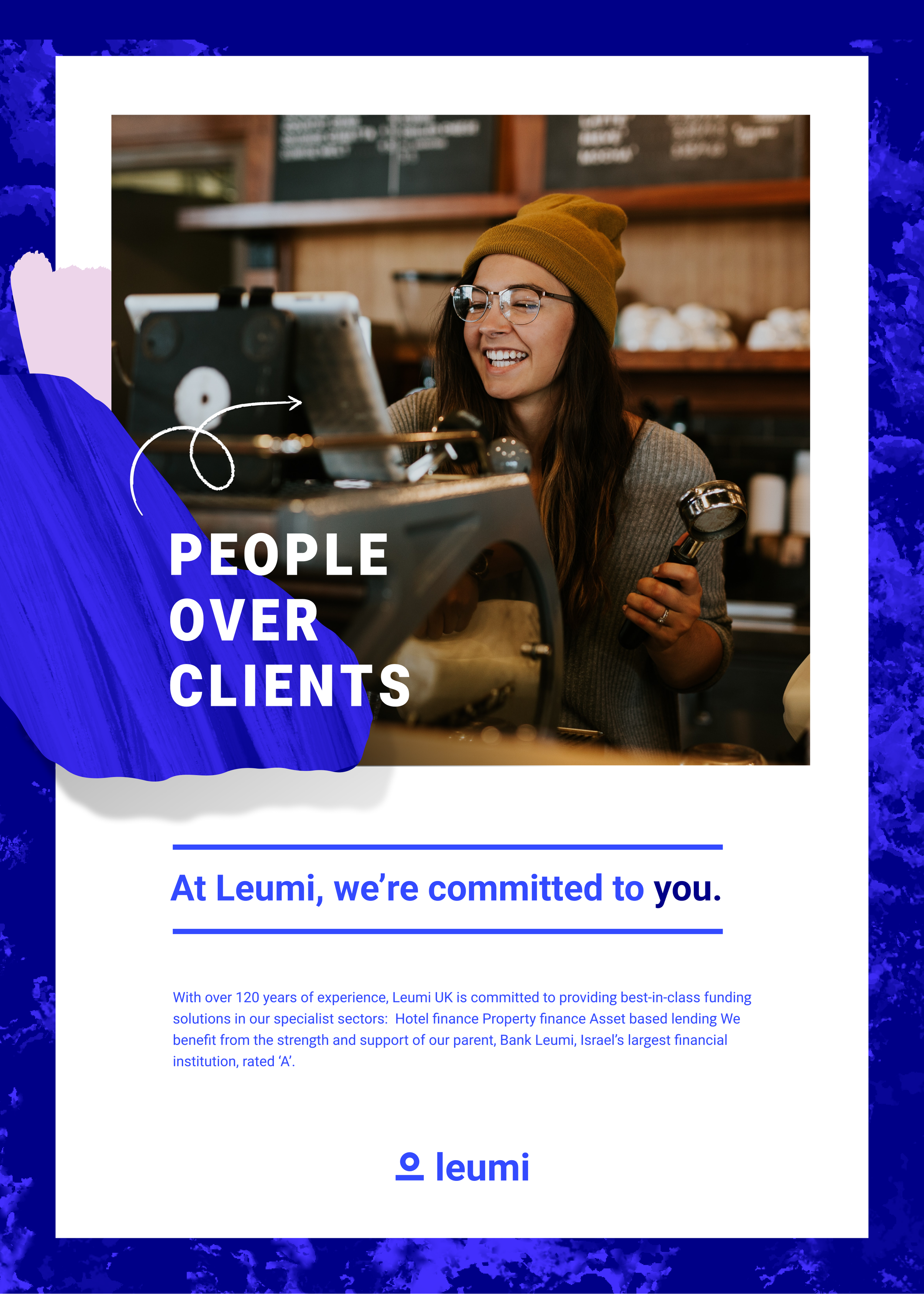
Committed & connected Each aspect of the visual language is inspired by a brand : the shapes, lines and photography working together to imply friendliness, connection and a people-first mindset.
Language and material
Applications
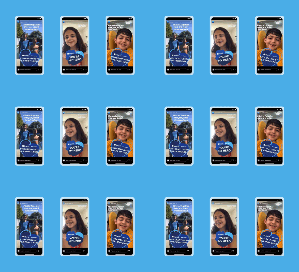
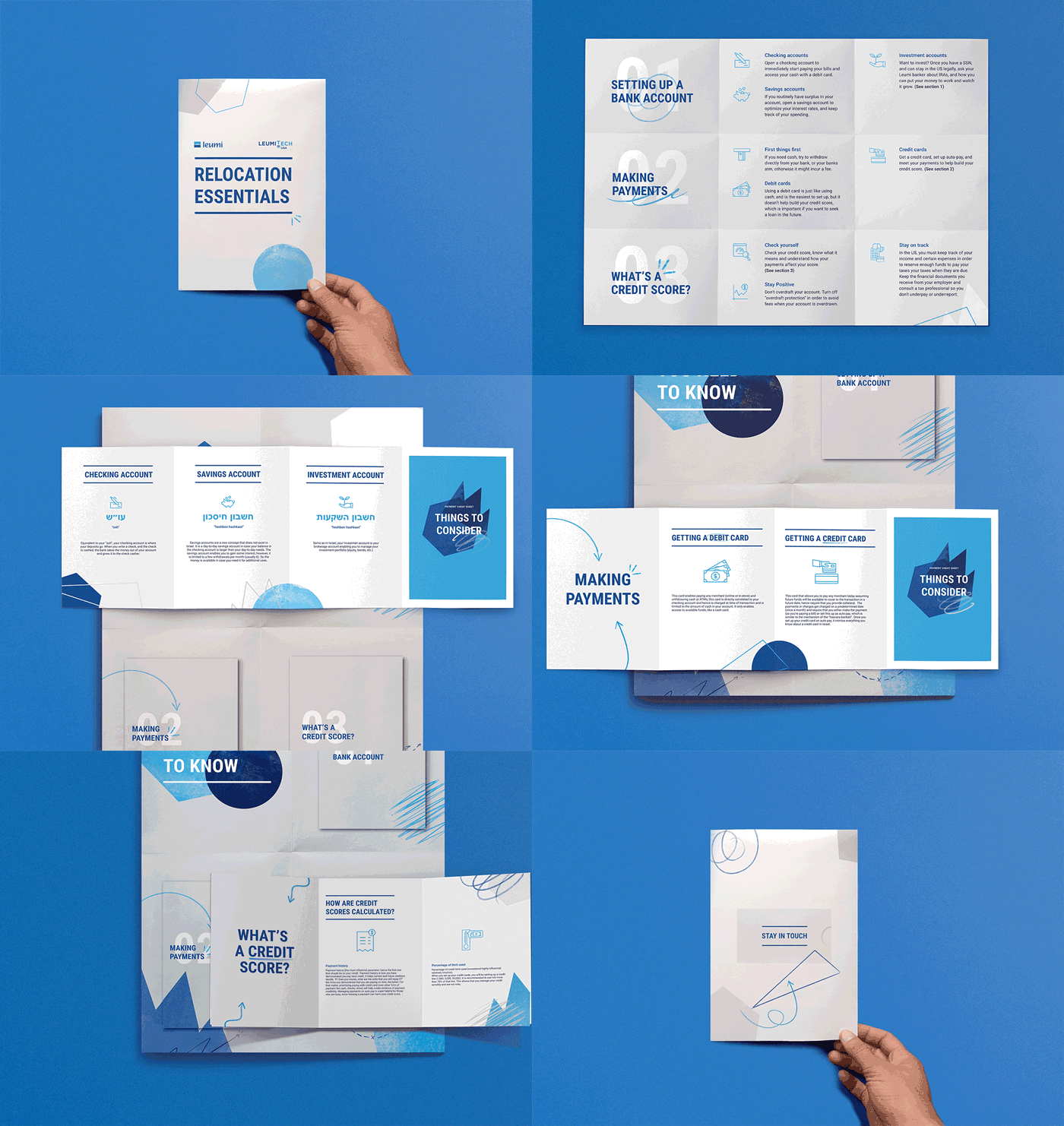
Leumi is a bank built for the people. Bringing their brand values to life across every medium, we ensure they represent themselves effectively and communicate in a way that fosters more profound connections with the Leumi brand.


